Prize Wheel Artwork has two jobs at an event: it should attract attention from a distance and explain the result when the wheel stops. Those jobs need different kinds of information. A colourful silhouette and recognisable brand can catch the eye across an exhibition aisle, while the words inside each segment need to make sense to someone standing beside the pointer. Treating the wheel as a miniature poster often makes both tasks harder. These real examples show how colour, wording, the centre disc and the pedestal can work together without trying to put the entire promotion into every wedge.
Prize Wheel Artwork starts with the result labels
Write the outcome list before choosing the background pattern. Each segment should use a short, consistent name that the host and participant can recognise. If one prize is called a voucher on the wheel but a coupon at the redemption desk, the artwork introduces an avoidable question. Where possible, use the same wording on the wheel, the host’s reference sheet and the prize labels. Distinguish the headline reward from any explanation that belongs in the participation terms or on a separate sign.
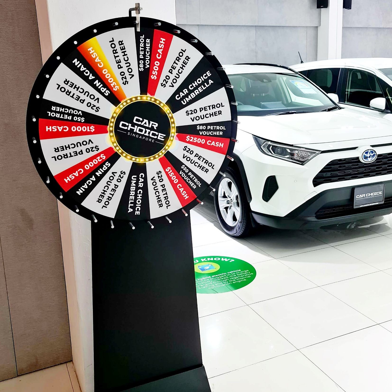
The showroom example uses bold lettering against black, white and coloured sections. Its labels are much more prominent than decorative illustrations. That is useful to study as a hierarchy, rather than copying the offers shown in a past promotion. An old photograph does not establish current prizes, prices or terms. Your artwork should reflect the actual rewards agreed for your own event. Big Top’s lucky draw machine rental service includes several wheel formats that can be discussed before the graphic layout is finalised.
Keep the shortest words in the narrowest spaces
A wedge gets narrower towards the centre, so a text line that looks comfortable at the rim may become crowded closer to the hub. Ask for the machine’s artwork template before laying out the labels. Do not assume that a circle drawn on a presentation slide matches the usable print area, centre fitting or outer pegs. The exact wheel model should determine the template, and the final design should be checked against that model.
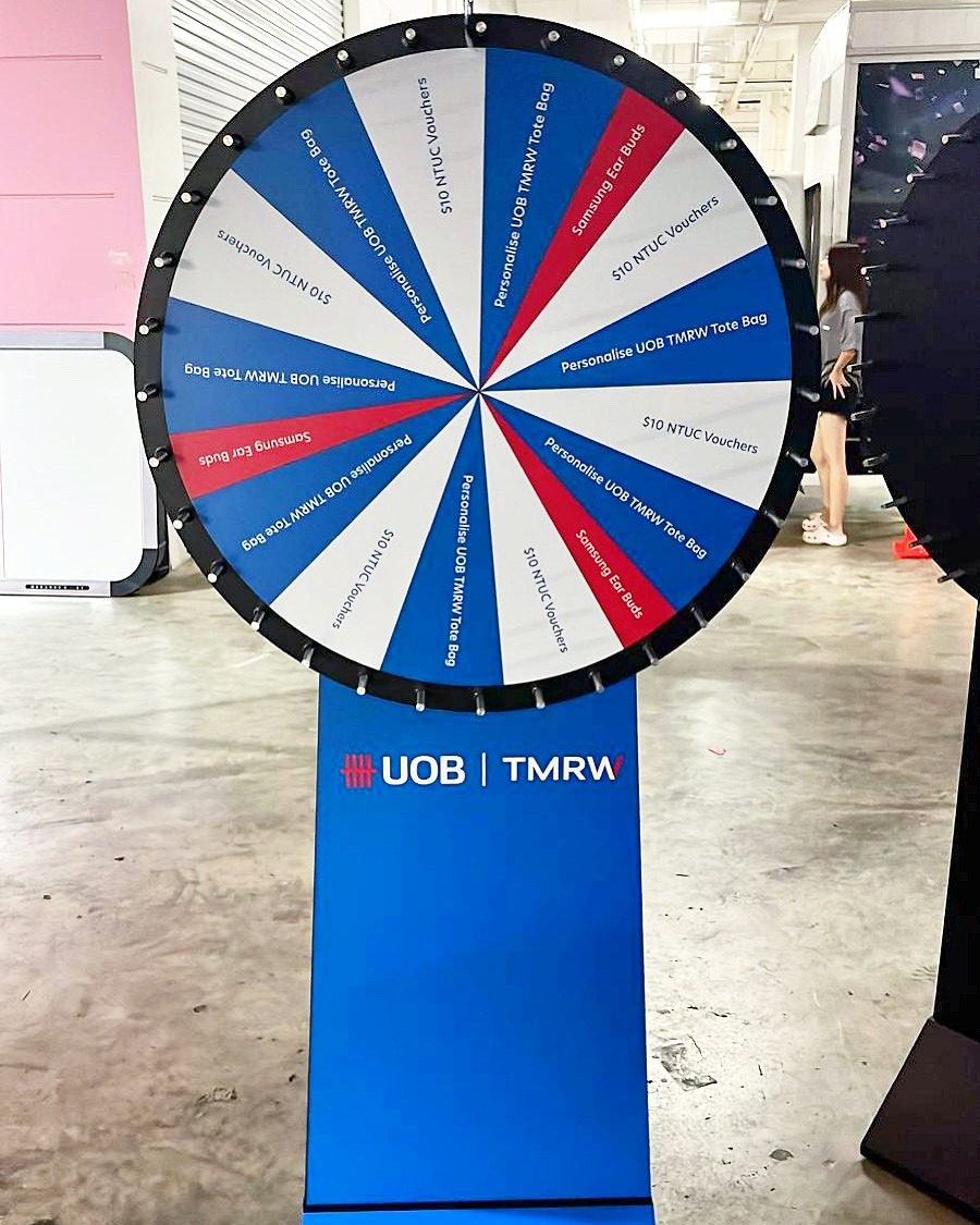
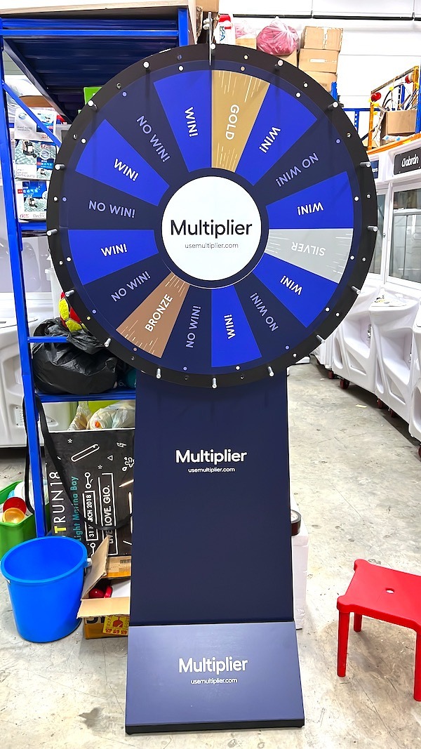
The blue and white example shows short phrases following the direction of the segments. Notice how the centre stays relatively simple. Long explanations would make the same arrangement harder to scan. If a reward needs several conditions, use a concise label on the wheel and place the full explanation in clearly visible supporting material. The participant should be able to identify the stopped segment without reading a paragraph sideways. Proofread numbers and spelling separately from the visual review; attractive colour cannot correct a wrong reward name.
Use colour to separate outcomes, then check the lettering
Alternating colours help the eye distinguish neighbouring segments, but the lettering still needs enough contrast against each individual background. White text can work well on a dark blue segment and become difficult to read on a pale yellow one. Review every colour combination rather than approving one sample wedge and assuming the rest will behave the same way. A palette can remain consistent with the brand while using different text colours where needed.
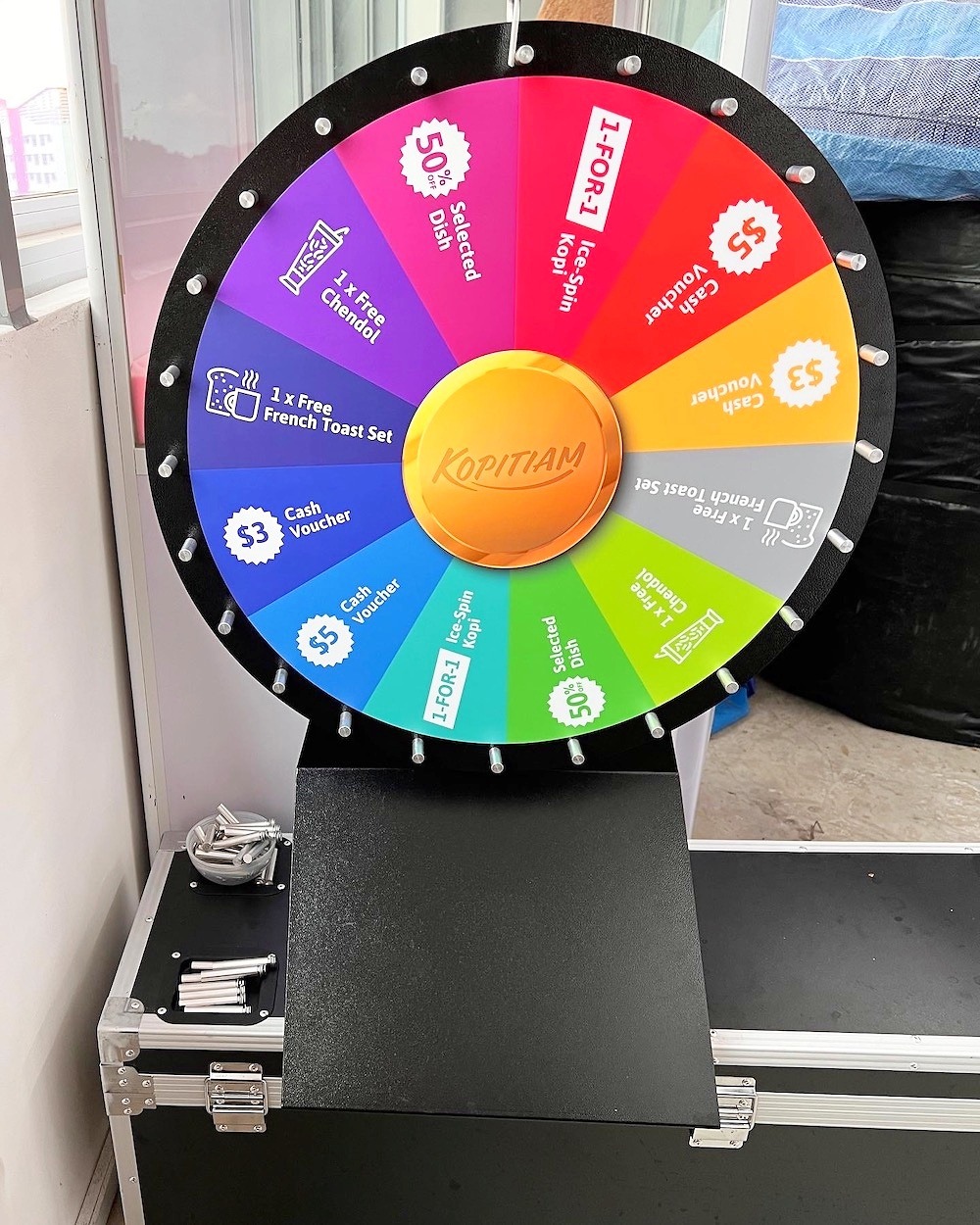
The tabletop example combines several bright colours with simple icons and short labels. The small format makes restraint especially useful. Avoid relying on colour alone to communicate an outcome: a readable name or recognisable symbol gives the host another way to explain it. Print a proof at the intended scale if possible and view it from the participant’s position. A design that looks clear while zoomed in on a laptop may need larger lettering when seen across a counter.
Give the centre and pedestal separate jobs
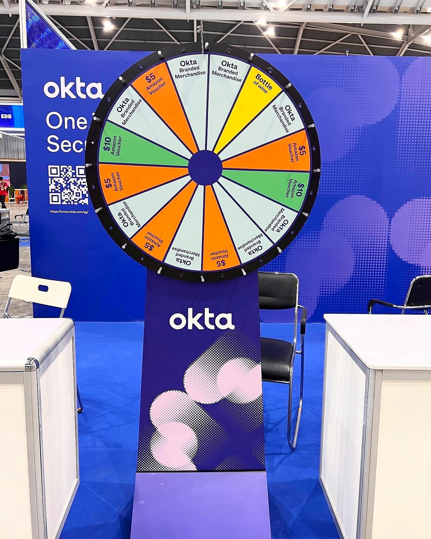
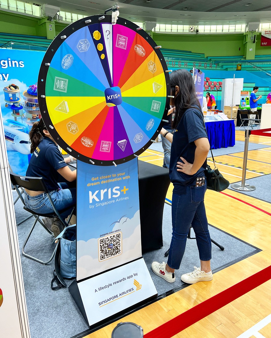
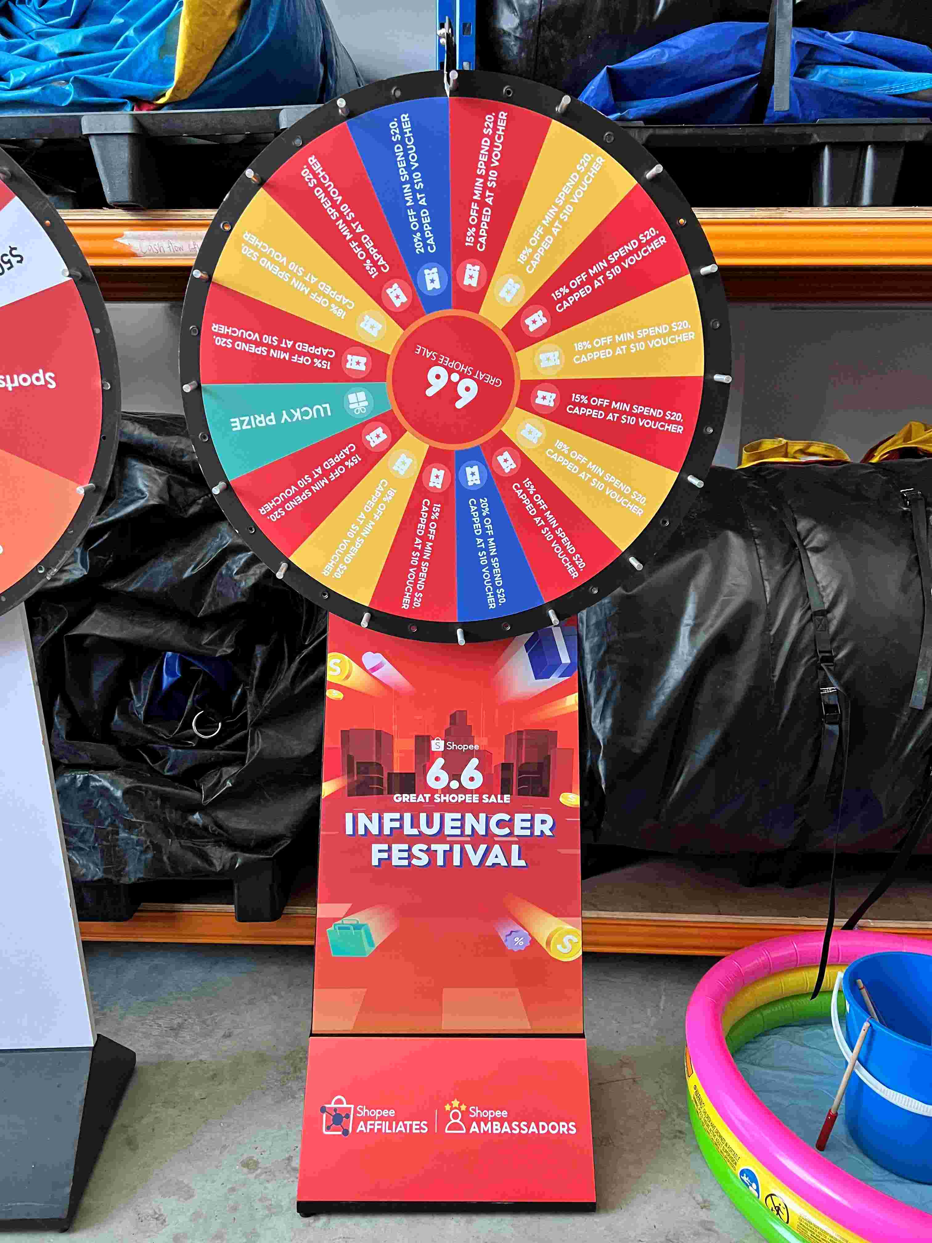
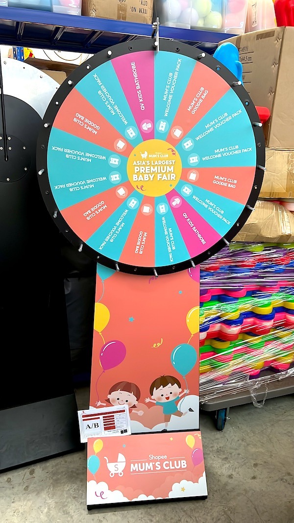
The centre disc is a natural place for a compact brand mark. The pedestal can carry a larger campaign message, decorative illustration or a next-step instruction. Using these surfaces deliberately keeps the wheel face focused on the result. It also helps the equipment look connected to the booth when the wheel is turning and its individual labels cannot be read. The shopping-promotion example uses a branded base below the colourful wheel, with supporting information kept away from the wedges.
A QR code is often easier to scan on a stationary pedestal or nearby sign than on a moving surface. If one is included, test the final printed code on several phones at the intended distance. Leave the required clear area around it and check that other graphics do not crowd it. Confirm the destination page before print approval, including whether visitors will need to sign in. The artwork should direct people to a working, relevant next step rather than simply adding a code because there is spare space.
Review the wheel against the actual booth backdrop
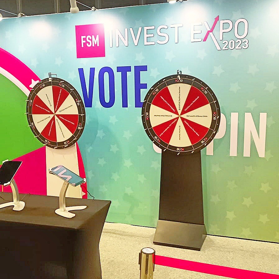
A wheel that stands out against a plain wall can blend into a busy exhibition graphic. Compare the proposed face and pedestal with the surrounding colours, counters and signage. The paired red and white wheels in the exhibition example use a restrained palette beside a much larger backdrop. Their circular shapes remain identifiable without reproducing every element of the background artwork. Sometimes simplifying the wheel is more effective than adding another layer of decoration.
If two wheels are used together, decide whether they are meant to look identical or serve visibly different purposes. Consistent branding can connect them, while a clear heading or distinct colour treatment can distinguish their roles. Do not ask the artwork alone to explain a complicated participation process. The host’s explanation and supporting signs should agree with what visitors see on the equipment. Confirm the physical setup with the supplier before approving graphics that assume a particular stand or display height.
Compare different visual treatments
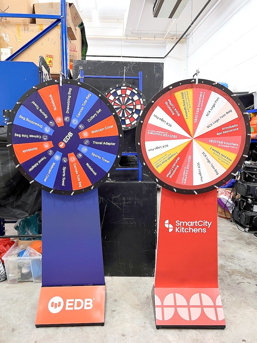
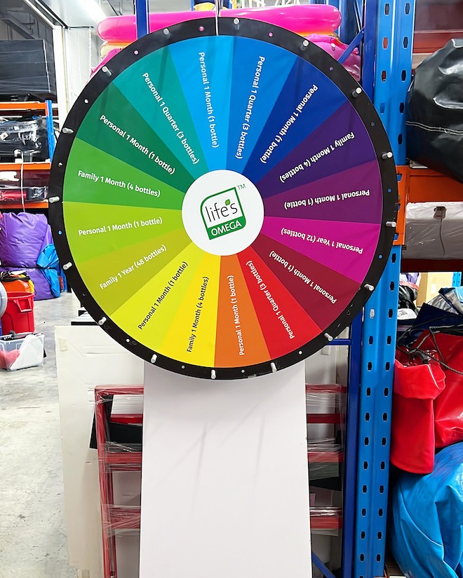
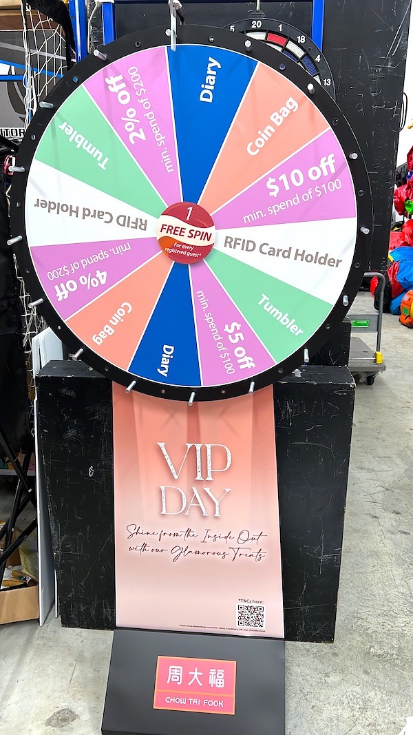
The gallery below brings together festival, corporate, rainbow, family and retail examples. Look at how much information appears on the wheel itself and how much moves onto the base. Some designs rely on a small number of brand colours; others use a rainbow to distinguish segments. Neither approach is automatically better. The useful test is whether the intended audience can recognise the event, understand the labels and identify the result without the host having to translate the artwork.
Approve the complete set before printing
Bring the wheel face, centre disc, pedestal artwork and any supporting sign into the same review. Check that the campaign name, reward wording and visual style agree across all of them. Ask the production team which areas are covered by hardware and which files need separate print preparation. Keep a final approved version so that an outdated label does not accidentally return during a last-minute revision.
For another view of available formats, Carnival People’s lucky draw equipment service includes spinning-wheel options. Use service references to compare the physical format, then develop original graphics for your own event. Share your proposed outcome labels and brand assets with Big Top early. Clear Prize Wheel Artwork makes the moment of stopping easy to understand while allowing the wider display to carry the character of the campaign.


